Graph-Based Lineage
SQL Glider's graph feature lets you build, merge, and query column-level lineage across multiple SQL files. This is the key feature for understanding data flow at scale — across an entire SQL codebase rather than a single query.
Why Graph Lineage?
The basic sqlglider lineage command analyzes one SQL file at a time. That works for understanding a single query, but real data pipelines span many files: staging tables feed into dimensions, dimensions feed into reports, and so on.
The graph commands connect the dots across files, so you can answer questions like:
- "What raw sources ultimately feed into this report column?"
- "If I change this column in the staging table, what downstream reports break?"
Tutorial: Your First Lineage Graph
This walkthrough uses a simple three-file pipeline to demonstrate the full workflow.
Step 1: Set Up Example SQL Files
Create a queries/ directory with three files representing a typical data pipeline:
queries/customers.sql — Staging layer
-- Customer dimension table
SELECT
    customer_id,
    customer_name,
    email,
    created_at
FROM raw_customers;
queries/orders.sql — Staging layer
queries/reports.sql — Reporting layer (joins the two staging tables)
-- Customer orders summary report
SELECT
    c.customer_name,
    c.email,
    COUNT(o.order_id) AS total_orders,
    SUM(o.order_total) AS total_spent,
    MAX(o.order_date) AS last_order_date
FROM customers c
JOIN orders o ON c.customer_id = o.customer_id
GROUP BY c.customer_name, c.email;
Step 2: Build the Graph
Build a lineage graph from the entire directory:
This recursively scans queries/ for .sql files, parses each one, and writes the combined lineage graph to graph.json.
Useful build options
Step 3: Query Upstream Lineage
Find out where a report column gets its data from:
Example output:
                              Sources for 'total_spent'
+---------------------------------------------------------------------------------------------+
| Column      | Table  | Hops | Root | Leaf | Paths                             | File        |
|-------------+--------+------+------+------+-----------------------------------+-------------|
| order_total | orders |    1 |  Y   |  N   | orders.order_total -> total_spent | reports.sql |
+---------------------------------------------------------------------------------------------+

Total: 1 column(s)
Here's how to read each column:
| Field | Description |
|---|---|
| Column | The source column name |
| Table | The table that column belongs to |
| Hops | How many steps away from the queried column (1 = direct source) |
| Root | Y if this is an ultimate source with no further upstream dependencies |
| Leaf | Y if this is a final output with no further downstream consumers |
| Paths | The full data flow path, read left to right with -> separating each step |
| File | Which SQL file defines this relationship |
In this example, total_spent has one source: orders.order_total from reports.sql. It's 1 hop away, and it's a root node (Y) meaning orders.order_total is an ultimate source — there's nothing further upstream in this graph. It's not a leaf (N) because it feeds into total_spent.
Step 4: Query Downstream Lineage
Now ask the reverse question — if orders.order_total changes, what's affected?
Example output:
                          Affected Columns for 'orders.order_total'
+--------------------------------------------------------------------------------------------+
| Column      | Table | Hops | Root | Leaf | Paths                             | File        |
|-------------+-------+------+------+------+-----------------------------------+-------------|
| total_spent |       |    1 |  N   |  Y   | orders.order_total -> total_spent | reports.sql |
+--------------------------------------------------------------------------------------------+

Total: 1 column(s)
This tells you that changing orders.order_total would impact total_spent, which is a leaf node (Y) — a final output with no further downstream consumers.
Impact analysis
Downstream queries are the foundation of impact analysis. Before changing a source column, run a downstream query to understand the blast radius.
Step 5: Export Results
Query results support multiple output formats:
# JSON for programmatic use
sqlglider graph query graph.json --upstream total_spent -f json

# CSV for spreadsheets
sqlglider graph query graph.json --upstream total_spent -f csv
Example: Upstream Lineage in JSON
JSON output is especially useful when you want to feed lineage data into other tools — CI checks, data catalogs, documentation generators, or custom dashboards. Here's what the upstream query for total_spent looks like in JSON:
{
  "query_column": "total_spent",
  "direction": "upstream",
  "count": 1,
  "columns": [
    {
      "identifier": "orders.order_total",
      "file_path": "queries/reports.sql",
      "query_index": 0,
      "schema_name": null,
      "table": "orders",
      "column": "order_total",
      "hops": 1,
      "output_column": "total_spent",
      "is_root": true,
      "is_leaf": false,
      "paths": [
        ["orders.order_total", "total_spent"]
      ]
    }
  ]
}
Each entry in columns tells you:
| Field | Description |
|---|---|
identifier |
Fully qualified source column (table.column) |
file_path |
The SQL file that defines this relationship |
query_index |
Which query in the file (0-based, for multi-statement files) |
table / column |
Parsed components of the identifier |
hops |
Distance from the queried column (1 = direct source) |
is_root |
true if this column has no further upstream sources |
is_leaf |
true if this column has no downstream consumers |
paths |
Every path from this source to the queried column, as ordered node lists |
Tracing lineage across files
The file_path field is particularly valuable in large graphs spanning dozens or hundreds of SQL files. It tells you exactly which file defines each relationship, so you can trace a column's journey across your entire pipeline — from raw ingestion scripts through staging layers to final reports — without having to search through files manually.
Using JSON output in CI
JSON output pairs well with tools like jq for scripted checks. For example, to list all root source tables feeding a report column:
Visualizing Lineage
SQL Glider can generate diagrams from lineage graphs in Mermaid, DOT (Graphviz), and Plotly formats. Mermaid and DOT are text-based diagram languages that render in many tools — Mermaid works natively in GitHub Markdown, GitLab, Notion, and more; DOT can be rendered with Graphviz into SVG, PNG, or PDF. Plotly outputs JSON that can be loaded into interactive Plotly/Dash applications.
Visualize an Entire Graph
The graph visualize command renders every node and edge in a graph file:
# Mermaid (default)
sqlglider graph visualize graph.json

# DOT (Graphviz)
sqlglider graph visualize graph.json -f dot

# Plotly JSON (for interactive visualization)
sqlglider graph visualize graph.json -f plotly

# Save to file
sqlglider graph visualize graph.json -o lineage.mmd
sqlglider graph visualize graph.json -f dot -o lineage.dot
sqlglider graph visualize graph.json -f plotly -o lineage.json
Diagram Output from Queries
The graph query command also supports diagram formats. This is useful for visualizing just the upstream or downstream subgraph for a specific column:
# Mermaid diagram of upstream sources
sqlglider graph query graph.json --upstream total_spent -f mermaid

# DOT diagram of downstream impact
sqlglider graph query graph.json --downstream orders.order_total -f dot

# Plotly JSON for interactive exploration
sqlglider graph query graph.json --upstream total_spent -f plotly
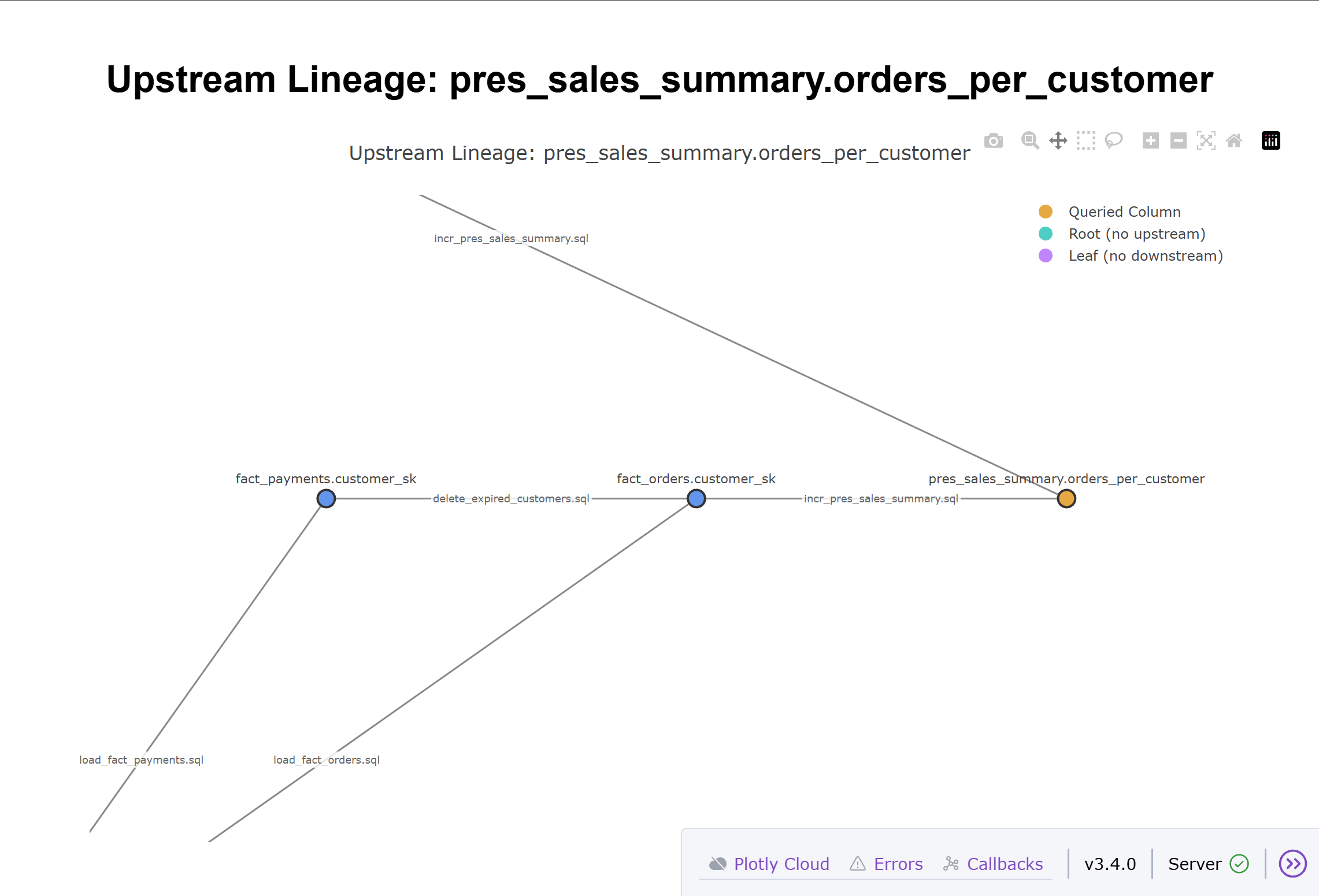
Query diagrams include color-coded nodes, edge labels showing the source SQL file, and a legend:
| Color | Meaning |
|---|---|
| Amber | The queried column |
| Teal | Root node (no upstream dependencies) |
| Violet | Leaf node (no downstream consumers) |
Each edge in the diagram is labeled with the SQL filename that defines that relationship, making it easy to trace data flow back to the source code.
Example: Imagine a pipeline where a revenue report column draws from multiple sources through several transformation layers. Querying --upstream revenue would produce a diagram like this:
flowchart TD
    raw_orders_amount["raw_orders.amount"]
    raw_orders_tax["raw_orders.tax"]
    raw_exchange_rates_rate["raw_exchange_rates.rate"]
    staging_orders_subtotal["staging_orders.subtotal"]
    staging_orders_tax_amount["staging_orders.tax_amount"]
    mart_orders_total_usd["mart_orders.total_usd"]
    revenue["revenue"]
    raw_orders_amount -->|staging_orders.sql| staging_orders_subtotal
    raw_orders_tax -->|staging_orders.sql| staging_orders_tax_amount
    staging_orders_subtotal -->|mart_orders.sql| mart_orders_total_usd
    staging_orders_tax_amount -->|mart_orders.sql| mart_orders_total_usd
    raw_exchange_rates_rate -->|mart_orders.sql| mart_orders_total_usd
    mart_orders_total_usd -->|reports.sql| revenue

    style revenue fill:#e6a843,stroke:#b8860b,stroke-width:3px
    style raw_orders_amount fill:#4ecdc4,stroke:#2b9e96
    style raw_orders_tax fill:#4ecdc4,stroke:#2b9e96
    style raw_exchange_rates_rate fill:#4ecdc4,stroke:#2b9e96

    subgraph Legend
        legend_queried["Queried Column"]
        legend_root["Root (no upstream)"]
        legend_leaf["Leaf (no downstream)"]
    end
    style legend_queried fill:#e6a843,stroke:#b8860b,stroke-width:3px
    style legend_root fill:#4ecdc4,stroke:#2b9e96
    style legend_leaf fill:#c084fc,stroke:#7c3aed
The amber node is the column you queried (revenue), teal nodes are ultimate root sources with no further upstream dependencies (raw_orders.amount, raw_orders.tax, raw_exchange_rates.rate), and intermediate nodes (staging_orders.*, mart_orders.*) appear in the default style. Each edge is labeled with the SQL file that defines that relationship. The legend is included automatically.
Mermaid Markdown Format
The mermaid-markdown format wraps the diagram in a fenced code block, ready to paste directly into a .md file:
# Output a markdown-ready Mermaid block
sqlglider graph query graph.json --upstream total_spent -f mermaid-markdown

# Works with visualize too
sqlglider graph visualize graph.json -f mermaid-markdown -o lineage.md
This produces output with the ```mermaid fence included, so the diagram renders automatically when viewed in GitHub, GitLab, or any markdown tool with Mermaid support.
Plotly Interactive Visualization
The plotly format outputs a JSON figure specification that can be loaded into Plotly or Dash applications for interactive visualization with zooming, panning, and hover details.
Optional Dependency
Plotly output requires an optional dependency. Install it with:
Better Layout with Graphviz
For complex graphs with many nodes and edges, installing Graphviz on your system enables an optimized layout algorithm that minimizes edge crossings. Without Graphviz, a simpler layout is used that may result in overlapping edges.
Example usage with Dash:
import plotly.io as pio
from dash import Dash, dcc, html

# Load the JSON output from sqlglider
with open("lineage.json") as f:
    fig = pio.from_json(f.read())

# Create an interactive Dash app
app = Dash(__name__)
app.layout = html.Div([
    html.H1("Lineage Graph"),
    dcc.Graph(figure=fig, style={"height": "80vh"})
])

if __name__ == "__main__":
    app.run(debug=True)
The Plotly output uses the same color scheme as Mermaid and DOT diagrams:
| Color | Meaning |
|---|---|
| Amber | The queried column |
| Teal | Root node (no upstream dependencies) |
| Violet | Leaf node (no downstream consumers) |
See an example of a plot loaded into Dash below:
Rendering Diagrams
Mermaid:
- Paste into any GitHub Markdown file or issue — it renders automatically
- Use the Mermaid Live Editor for interactive previewing
- Install mermaid-cli for local PNG/SVG export:
mmdc -i lineage.mmd -o lineage.png
DOT (Graphviz):
- Install Graphviz and render with:
dot -Tpng lineage.dot -o lineage.png - Use
-Tsvgfor scalable vector output - Many IDEs have Graphviz preview extensions
Plotly:
- Load the JSON into any Plotly-compatible environment (Python, Dash, Jupyter notebooks)
- SQL Glider includes a viewer script:
python examples/plotly_viewer.py lineage.json - Export to static images with
fig.write_image("lineage.png")
Building Graphs from Multiple Sources
Explicit File List
Manifest File
For large projects with mixed dialects, use a manifest CSV:
file_path,dialect
queries/spark/orders.sql,spark
queries/postgres/users.sql,postgres
queries/snowflake/reports.sql,snowflake
Directory with Custom Glob
Merging Graphs
If you build graphs separately (e.g., different teams or CI jobs), you can merge them:
# Merge specific files
sqlglider graph merge team_a.json team_b.json -o combined.json

# Merge with a glob pattern
sqlglider graph merge --glob "graphs/*.json" -o combined.json
Merging deduplicates nodes and edges automatically — if the same column appears in multiple graphs, it's stored once in the merged result.
Schema Resolution
By default, SQL Glider resolves lineage based on what it can infer from the SQL alone. For queries with SELECT *, this may not be enough. Schema resolution enables a two-pass approach:
# Pass 1 extracts schema from your SQL, Pass 2 uses it for resolution
sqlglider graph build queries/ -o graph.json --resolve-schema
You can also provide a schema file directly:
Or dump the extracted schema for inspection:
Templating Integration
If your SQL files use Jinja2 templates, pass templating options during the build: